Six Questions with Todd Colby
17.09.15

I don’t know how or why it started, but a long time ago I started collecting postcards, and what I immediately found out is that postcard collectors are insufferable people. They tend to insist that a postcard is the definitive record of what a place was and continues to be. They are almost too nostalgic to bear.
When I met Todd Colby about two years ago, I discovered the opposite: his works on paper, a lot like his poems, feel like they catapult themselves into being, but they come at you from the opposite end of insufferableness. They are almost too keyed-up to bear. A chance encounter with a bird leads him down a road that’s one part agitated, one part joyed, one part dumbstruck at the world around him. He can even make shitty advertising language sound fun.
Todd was an artist-in-residence on Governors Island this past summer, and among the other hilarious and startling pieces he created during those months, he started working on a series of repurposed linen postcards that capture the definitive record of what Governors Island was never like. Landmarks that never existed, wildlife that never existed, nostalgia ruined right and left. To me that’s Todd’s great punchline: it’s all made up, but it’s all gospel. His postcards strike me as this middle finger to postcard worshippers, but also a keyed-up celebration of the form. On the tail end of his residency on Governors Island, I asked Todd six questions about his postcards. —Danniel Schoonebeek
Danniel Schoonebeek: Talk to me a bit about how you arrived at making these Governors Island postcards. When I think about them I call them “repurposed postcards.” I use that word deliberately, as your postcards both blur and readjust the purpose of the originals: they don’t get sent to anyone, they strip away the tourism for which they were created, and, my favorite part, they inaccurately describe what they depict, as we see above. So why postcards?
Todd Colby: I’ve been collecting linen postcards for years. Every time I travel I look for stores that sell them. Many of the postcards in this series I picked up at Authentiques, a tiny store owned by two sweet, older gentlemen on 18th Street in Manhattan. I’ve shopped there for years, the owners remember me and always pull something out that they’ve been saving for me when I visit them. I also received a big stack of postcards depicting great scenes in the western U.S. from a friend as a gift that he’d purchased on eBay.
I started a residency out on Governors Island this past February (provided by the Lower Manhattan Cultural Council), and I began looking through the postcards, realizing that what was depicted on the postcards—waterfalls, oxen, canyons and so on—was what I wanted Governors Island to be when I arrived. After years of imagining what must be out there on that island, and then actually being there, it created a tension in my mind. As often happens when we visit a place after imagining it, our fantasies are stronger than the reality we’re confronted with.
Governors Island is striking in its beauty, and certainly its views of Manhattan and Brooklyn are stunning, but what I saw on those postcards overshadowed what I saw on the island. One afternoon I had a eureka moment and I decided to give the postcards words that would name places and events that I could imagine happening on the island. Certainly some touchstones for me were Raymond Roussel’s famous imaginary journeys, Georgio de Chirico’s novel Hebdomeros, as well as the writings and philosophy of the great pataphysical poets Rene Daumal, Francis Picabia, and Alfred Jarry. All of these writers were inspirations for opening up my own fantastical landscape on Governors Island.
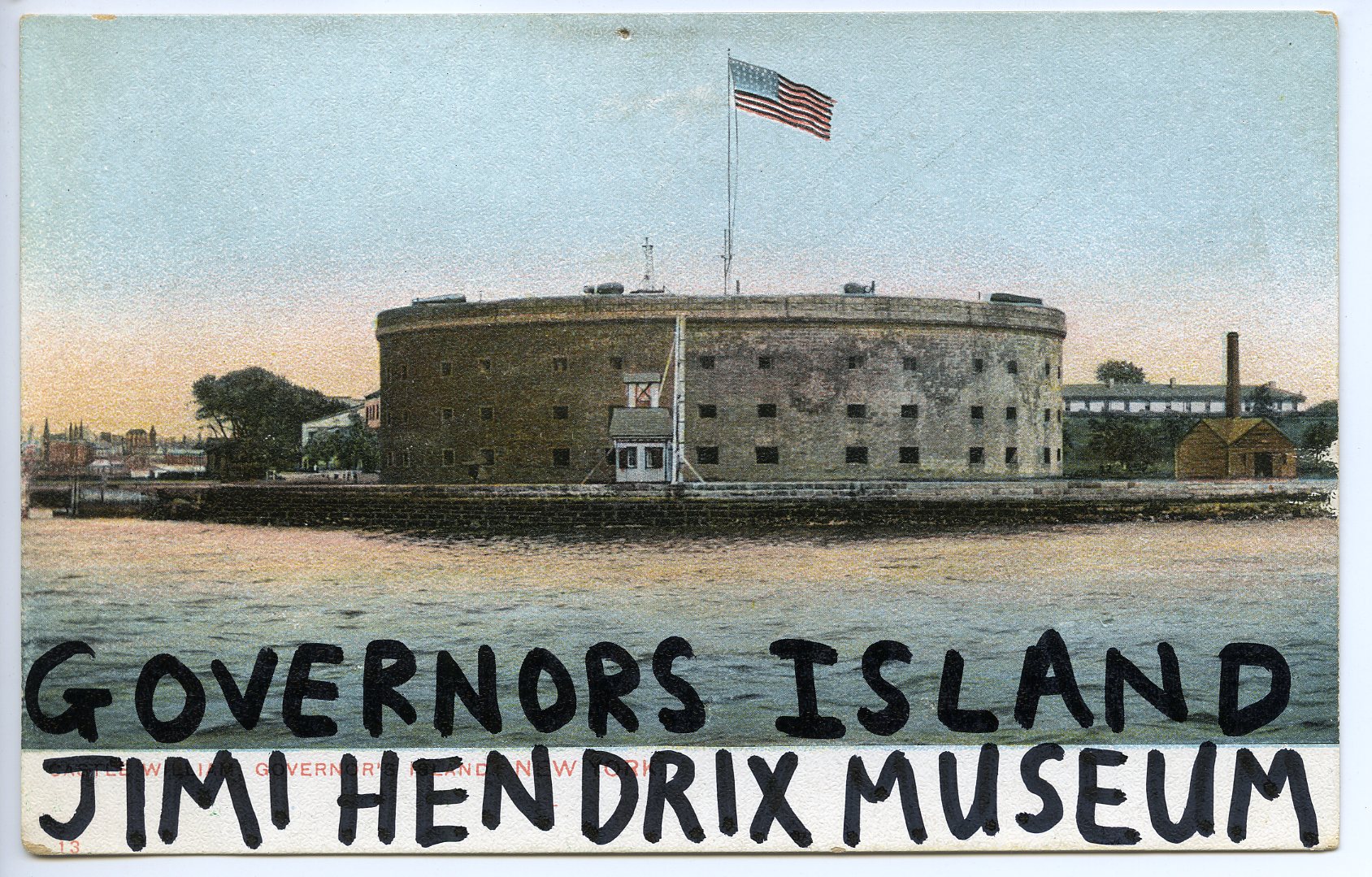
DS: I feel this immediate joy when I look at these postcards, which is the same way I experience your poems, but in both cases I think there’s something a bit more sinister underneath. With this postcard I smile at the thought of Governors Island having a Jimi Hendrix memorial, but then I almost immediately reconcile with the fact that GI (acronym intended) is famous for being a war base during the Revolutionary War. What’s your sense of the play between the comedic and the sinister in these works?
TC: There is certainly a lot of joy in these postcards and the words I’ve put on them. Perhaps even a playful sort of fiction that has a hint of the sinister trickster. While I was making them I kept asking myself, “Why the hell not?” I did a whole bunch of cards that were depicting imagined memorials on Governors Island for poets and artists that I love. I made postcards depicting memorials for Gertrude Stein, Guillaume Apollinaire, Arthur Rimbaud, Emily Dickinson, and others. The Jimi Hendrix museum came about while simply looking at the postcard of Castle Williams and imagining the fortress being a museum celebrating the most unlikely person a building like that could represent. Oddly, the more I look at that postcard, the more I could imagine a museum dedicated to Jimi Hendrix being right there in that formidable building.
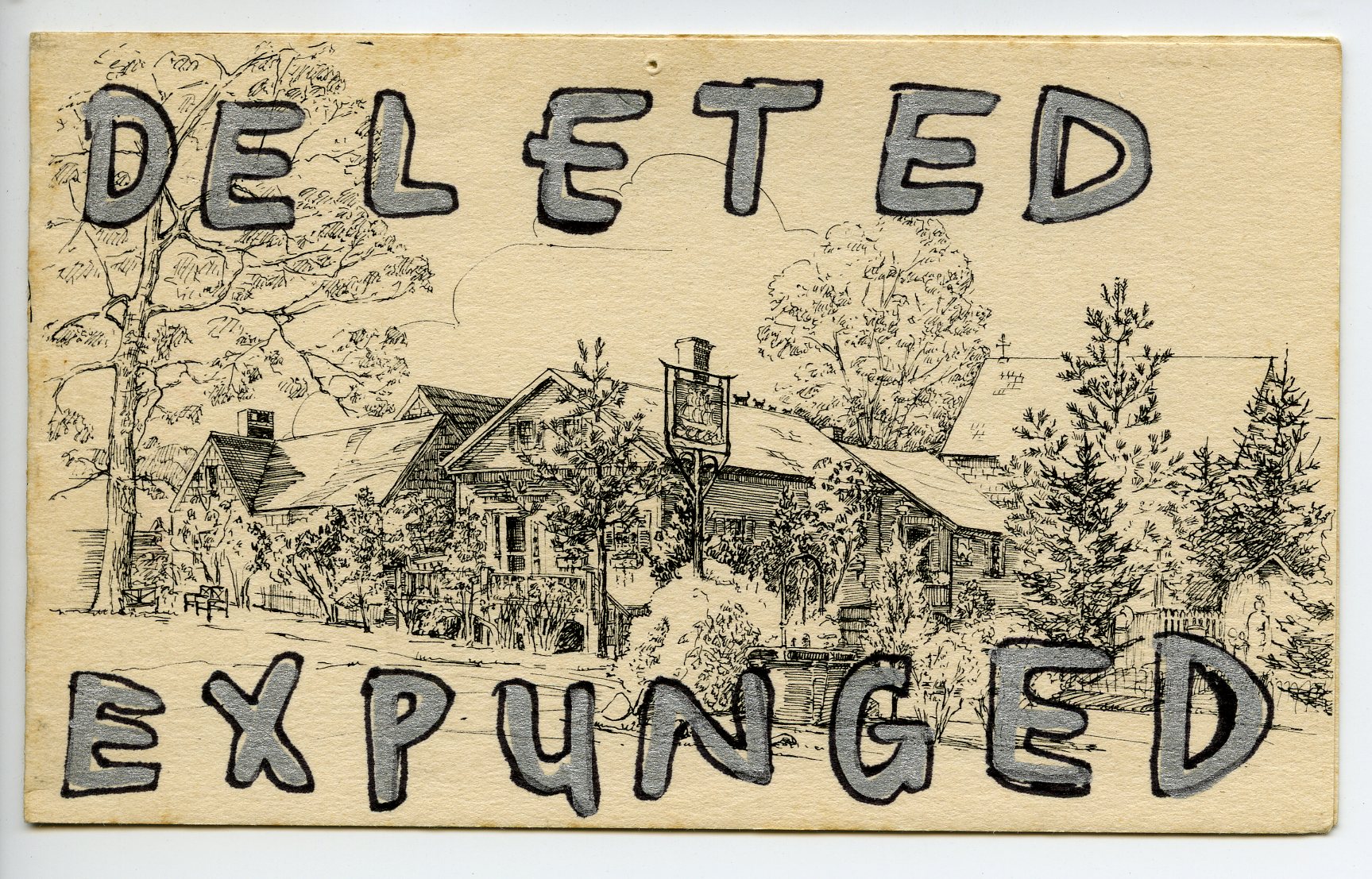
DS: This is one of the more aggressive ones in the series, which is a rare emotion, as they tend to have an almost demure aspect to them. This one reminds me a bit of when a piece of mail gets returned, stamped REFUSED. And I love the way the colorless aspect of the postcard gives some suggestion that it’s a blueprint. Not only was this building turned down, it’s revolting, it was expunged. Do you feel any combativeness with the geography of the island or its history?
TC: The story with this one is actually quite straightforward. It lacks the color and texture of the other cards in the series and I was ready to discard it because it lacked those qualities I look for in old postcards. It also looks like an elaborate old cabin compound that could very likely have been turned into a fancy steakhouse, were it upstate somewhere. So, I quite literally deleted and expunged it. The aggressive, in-your-face finality of it grew on me, so I kept it as part of the series.
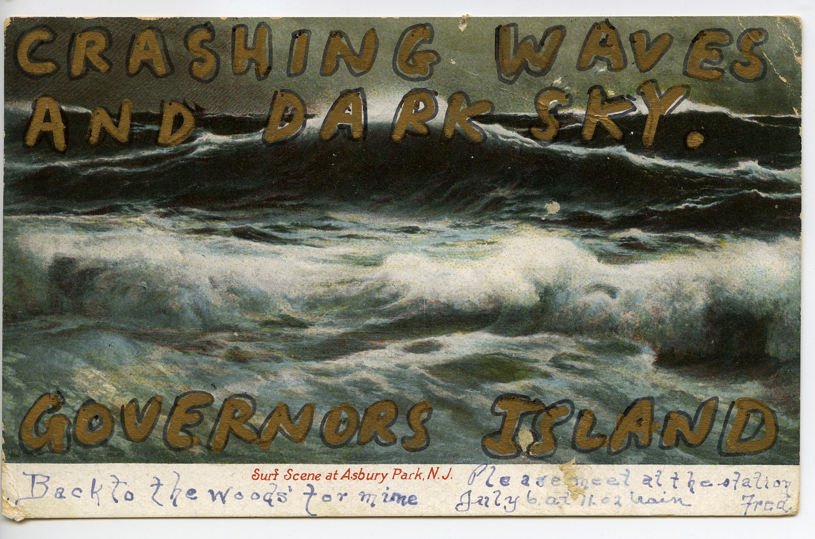
DS: The history of the postcard is under consideration in this series too: before 1907, the beginning of the so-called “divided back era,” people were prohibited to write missives on the backs of postcards, and as a result they often wrote notes on the fronts of the cards. I love that you left the handwriting here, whereas in some of the others you redact it. This one says, among other things, “Back to the woods’ for mime” and is signed by “Fred.” A lot of the work you’re doing with these postcards is captioning them in a way that skews them. To me this caption is wonderful in how it underscores the obviousness of the image and also plays off the handwriting. And you leave the Asbury Park caption! Talk about this one!
TC: I love that this postcard had actual handwriting on the face of it, written by the man who purchased the card originally. I didn’t want to cover it up or alter it because it seemed like a sacrilege to cover “Fred’s” writing. With that in mind, I simply wrote what I saw: Crashing waves and dark sky. The stormy, ominous mood appealed to me. I kept the Asbury Park caption because I loved the font and I could imagine Fred spending a rainy weekend at the beach before he headed back to the woods for “mime.”
Fred is mysterious to me. Was he really a mime, or was this a coded reference to something else entirely? Also, depictions of beaches are usually presented all sunny and colorful. This is one of those rare depictions of a touristy postcard with the world presented darkly, with a roiling, uninviting ocean.
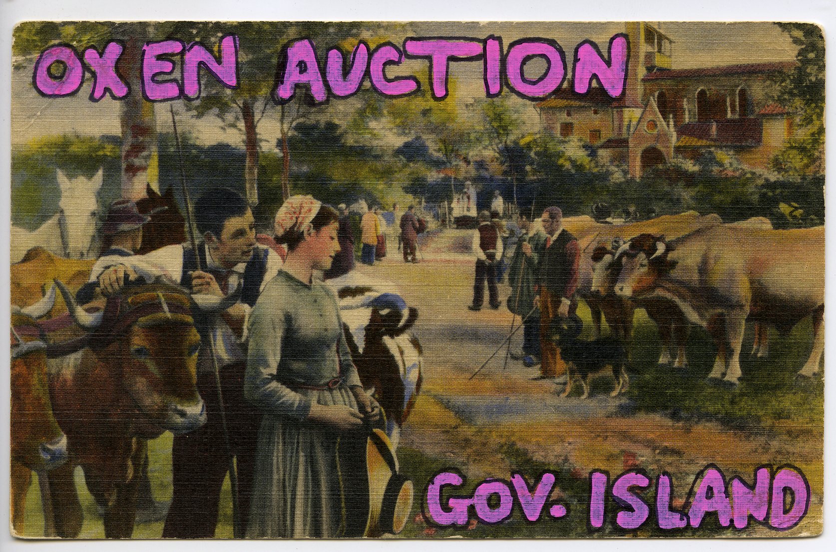
DS: The funny thing about this one is that it actually still looks like it could happen on present-day Governors Island. But the hot pink paint marker, and the abbreviated designation, throw the image out of its comfort zone. Can you talk about your handwriting a bit? And I also think the phrase “oxen auction” is indicative of your smarts as a poet—how do these works on paper interact with your writing?
TC: I like this card because it does look like an actual historical scene that could have transpired on Governors Island. The building in the background and the trees could all have been on the island. In this instance I was being pretty literal, though I’m fairly certain Oxen Auctions were never staged there. I don’t have the world’s best handwriting so when I wrote words on these postcards I had to really concentrate and make it as neat and legible as possible. A great help was discovering these oil markers that Sharpie makes. They are opaque and provide a real vivid color on the washed out postcards. The pink lettering in this instance is so incongruous with the scene depicted that it just works.
The most appealing element of this postcard for me is the melancholy look of the couple in the foreground. Something about the way they’re depicted makes me think they’re parting with a beloved ox they’d just sold because they were strapped for cash. The garish pink lettering seems like a perfect counterpoint to what I imagined was the sadness of the couple selling their beloved ox at an impersonal auction.
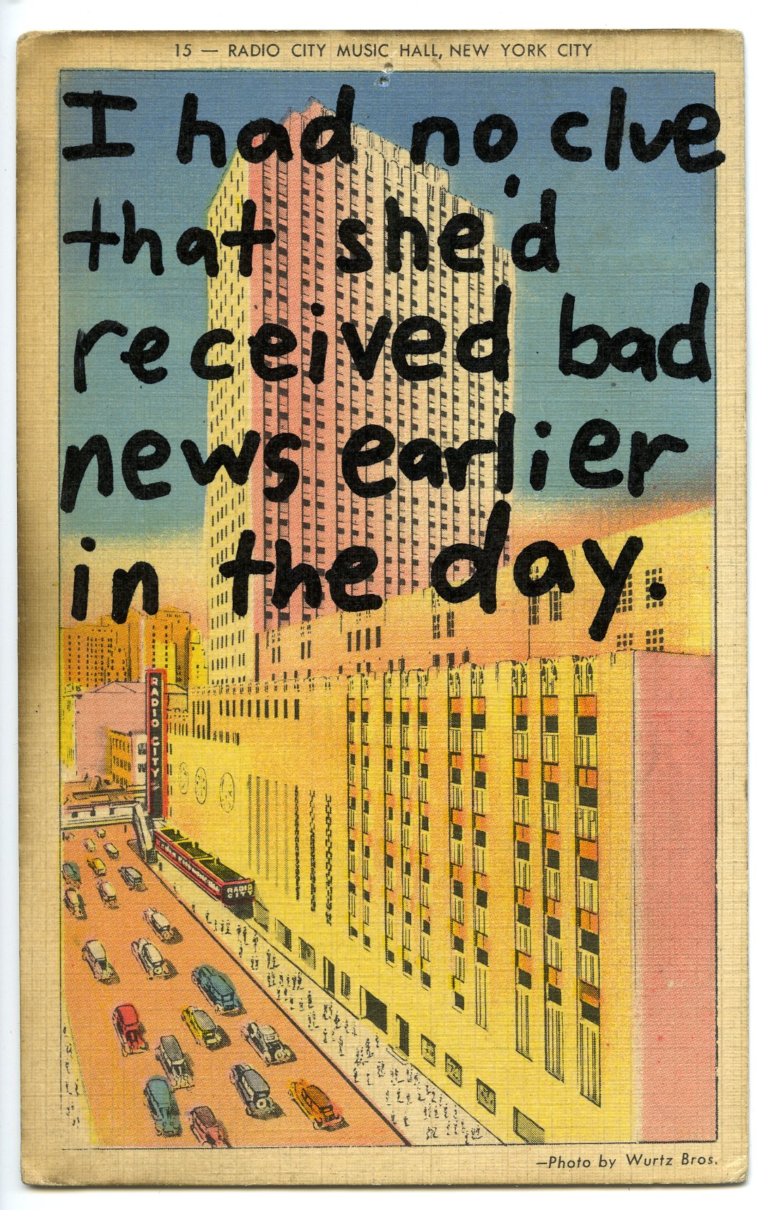
DS: And finally, not only the most ambiguous piece out of these six, but maybe the saddest. First I’m struck at how the handwriting stops off so sharply at the halfway point of the image. And yet those cars still sweep away bottom left. Where are they going? I think it’s also hard, since the text is splayed so loudly over this building that rises into the New York skyline, not to hear an echo of 21st century violence in this one, especially combined with the text. What is the bad news here?
TC: This is the one postcard that’s most grounded in fact. The day I made this I found out that a friend I’d talked and joked with at a party the night before had been told she had terminal cancer only hours before going to the party. There was no indication that she’d been given such horrible news. She was funny and delightful, without a hint of the news she’d received just hours before going to the party. That really struck a deep chord in me. That the words I wrote only cover half the postcard (blocking the sky) works in a way that feels cut off, ending abruptly, leaving the viewer with only a hectic, pastel-colored midtown that feels impersonal, dehumanized, and mechanical. The sadness of my friend’s illness is all right angles and harsh edges, no matter how much we try to beautify or romanticize it.