Clip/Stamp/Fold: The Radical Architecture of Little Magazines 196X to 197X
19.04.11

Clip/Stamp/Fold:
The Radical Architecture of Little Magazines 196X to 197X
Beatriz Colomina and Craig Buckley, Editors
Urtzi Grau, Image Editor
Actar, 2010
I attended a semester of architectural graduate school, insensibly blowing money and accruing debt, even though I’ve never had any inclination to make buildings of any sort. I was seduced by the graphic possibilities that architecture seemed so open to. As unhinged at it sounds, architecture was where book design was at. It’s as if the energy that fuels one field simply drifted onto another, accumulated there, and spawned exciting teratological specimens. Most impressive (or, at least, best distributed), at the time, was Rem Koolhaas and Bruce Mau’s economy-of-the-book-busting, ridiculously sized S, M , L , XL. Pencil my enthusiasm under the ‘youthful innocence’ column or whatever, but the book channeled the cracking electricity of Mau’s work over at Zone––what we now disparaging refer to as the spectacular Mau-fication of graphic design (see Hal Foster)––and merged it with Koolhaas’ own maverick textual production, all wrapped in a ridiculous splurge of money that was more P.T. Barnum folly than corporate committee planning. The perfume of disaster was laced with that new book smell when you first opened it.
The production of massive books (‘doorstops’, is the recurring joke), which became paradigmatic of the 1990s, has bled into the last decade and lamely determined the extravagant monograph as the go-to typology for architects who wish to show that they have crossed that ambiguous threshold that puts them on the road to being major international stars. This, of course, has morphed the quasi-daredevil book into a convoluted and formulaic specimen, a tacky symbol of the amount of money that was invested in its production, a gray corpse to the Warhol-silver of S, M , L , XL. In retrospect, what seems more exciting about the big books of the 1990s is that they rekindled interest in the very different architectural graphic production of the 1960s and 1970s–a fecund quarter century in which “little magazines” proliferated.1 An activist spirit infused every gesture in those publications with delirious hyperbole and sponsored reckless abandon as ethos. Ideas ran through the thousands of pages produced in those two decades as wildly as the LSD-to-speed kids who saw the Age of Aquarius drained into the arid cultural basin we began to call Late Capitalism without recoiling in horror.
__________
1. browse the “little magazines” here from Clip/Stamp/Fold
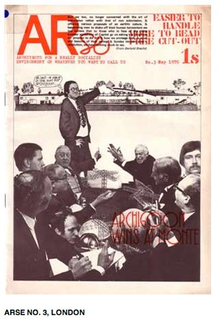
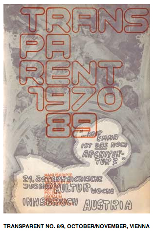 Clip/Stamp/Fold: The Radical Architecture of Little Magazines 196X to 197X is a massive book––a true doorstop––that accompanies a fantastic project and exhibition organized by Beatriz Colomina and Craig Buckley. It’s an exhaustive archive of the mostly small-run, cheaply produced, “erupting, underground, protest” (Banham) architectural magazines that dotted the global landscape in the 1960s. Visualize the project as a Dr. Strangelove-like global switchboard all of a sudden gone mad––tiny red strobes everywhere––indexing a massive eruption of deviant journals and you get it. Some of these “little magazines” have gone on to acquire iconographic status. One thinks of Archigram or Peter Eisenman’s Oppositions. But in general the original urgency and energy that compelled these cheap magazines to appear still electrifies things, and not just for nostalgic sops. There is something in being reminded that there was once a tangled and lively impulse–contestatory in some of its manifestations, more accommodating in others, but everywhere on overdrive–within popular culture, or at least at its edges. It wasn’t always as it is now: bottom-line exigencies and the “cutting edge” bound like the rotting corpse of siamese twins.
Clip/Stamp/Fold is an invaluable document, if perhaps a little mummified as an ultimately academic exercise in capturing a vibrant, lively, organic moment in the culture. But what choice is there really for the archivist, always the last to arrive to pick up the pieces and bind them back together. Only exorbitant enthusiasm animates the limp task of archive-making, and such enthusiasm, despite its tightly-buttoned academic side, is felt in this book, rescuing it from catastrophic lameness. The book not only reproduces a number of these magazines (probably the best part), but interviews dozens of people who were involved with them at the time. It also includes transcripts from a series of recent exchanges––in a section titled “Little Talks”––between people in the scene then. The transcripts are textured by a tense tug-of-war between the merciful humor of the few and the solemnity of the many––self-mythologizers to the core, most in this latter group.
 Finally, from the shore from where I’m looking on it, Clip/Stamp/Fold , irradiating its golden light from across the disciplinary frontier like some fantastic McGuffin, is a reminder of the neglect contemporary art history has shown the graphic production of the 1960s and 1970s by artists. There is, of course, the myth of the artists‘ journals. People will spout names like Avalanche, Interfunktionen, The Fox, Art-Language, RealLife, File, etc. An article will appear here and an interview there, a reprint of one of these magazines will pop up every few years, a series of incomplete internet archives exists, but it seems that the unacknowledged task of this myth of the artists’ journals is to excuse the absence of deep and systematic historical analysis and the anthological gathering of the various magazines. When do we get our wunderkammer of global “little magazines”? Clip/Stamp/Fold throws down a challenge.
If nothing else the art world needs such an archive as Benadril for its allergies toward the historical. There was once a time when the “little magazine” was a contestatory space, a vessel for arguments that raged against the way things were. Perhaps it’s right that the “little magazine” became the acerbic and uncompromising punk ‘zine and architecture and art moved toward formats more in line with the masters they have chosen to bow before. Although I began with S, M, L, XL, perhaps the genesis of post-critical market-chumminess, that book, whatever its capitulation to spectacle culture, still sought to insert considered positions into general discourse. What has gone missing, and not only in architectural books, is the critical counterweight, the contrarian proposal. And conservative formalism as militant theory, clad in bad prose and impenetrable jargon, doesn’t count. While in art books the loss of pissed-off antagonisms is mostly the case, more tragic may be the new big budget “little magazines” of the art world, like Maurizio Catellan et al.’s Charley, where it is always the case. Such “little magazines” are truly about nothing or worse––they are slapstick routines in which Capital writes congratulatory postcards to itself on its own achievements.
––––––––––––
See more articles from Gean Moreno on Fanzine here